Glyphr
世界中に届くデザインを。


プロジェクト概要
多言語デザインにおける一貫性と文化的適合性を保ったフォントを選定するための支援ツール。

解決策
フォントの形状を解析し、AIが最適な代替フォントを提案するFigmaプラグイン。ムードフィルター機能も搭載。

課題
多言語プロジェクトに適したフォント選びが困難で、デザインの統一性に課題が生じている

目標
視覚的に一貫性があり、文化に配慮したデザインを支援するシンプルかつ直感的なツールの構築。

ツール
Figma, Illustrator, Photoshop

担当範囲
UX/UIデザイン・リサーチ

タイムライン
2ヶ月

Research
Font Selection in Global Design
In the world of digital design, choosing the right typography is key. This case study dives into the challenge of picking fonts that work across different languages while keeping a unified, appealing look.

Why Fonts Matter in Multilingual Design
Multilingual design tailors digital experiences to varied linguistic audiences. Each language's unique characters, scripts, and styles make font choice crucial. Key considerations include:
Consistency and Coherence
Legibility and Readability
Communication
Cultural Relevance
Noto Sans
Helvetica World
Gill Sans Nova


Meet the Fonts of the Global Digital World
Recent font developments like Noto, Helvetica World, and Gill Sans Nova address the needs of a global digital audience with their multilingual support. Despite this, designers struggle to blend different fonts aesthetically due to limited options that support multiple languages effectively.
What Today's Font Pairing Tools Offer


Extensive Library
Native Plug-in
Multilingual Support
AI Adaptation

Mood Filter
Taskade
Monotype
Taskade
AI Adaptation
Multilingual Support
Mood Filter
Native Plug-in
Intuitive Interface
Multilingual Support
AI Adaptation
Mood Filter
Native Plug-in
Identifying the Target Audience

Students

Freelancers

Agencies
Maintaining Design Consistency
75%
Limited Font Availability
65%
Cultural Relevance
40%
Lack of Tools
60%
Slow Selection Process
35%
Others
15%
Designers say their biggest hurdles in multilingual font selection are keeping designs consistent, limited fonts, and a lack of tools—75% struggle most with maintaining consistency.
Here are the challenges we face:
Limited high-quality fonts for certain languages restrict creative possibilities.

Limited Options
Current tools provide minimal support for selecting multilingual fonts.

Inadequate Tools
Consistency across languages is difficult without culturally fitting fonts.

Multilingual Consistency
How can we streamline font selection for multilingual projects to help designers
easily create engaging and culturally relevant digital experiences?
The problem at hand is clear…
How might we provide real-time design feedback for seasoned UX/complex multilingual interfaces?
How might we provide real-time design feedbme design feedbme design feedback for seasoned UX/complex multilingual interfaces?
How might we provide real-time design feedbme design feedbme design feedback for seasoned UX/complex multilingual interfaces?

Alex Mitchell 22
Student
California
Background
Alex, a web design student in his early twenties, struggles with selecting fonts for multilingual projects. Despite his busy academic schedule, he is eager to tackle real-world design challenges to gain practical experience.
Pain points
Consistency
Variety
Relavance
Time
Target Personas
Sarah Walker 35
UX Designer
Texas

Background
Sarah, an experienced UX/UI designer at a leading e-commerce company, specializes in global interfaces and multilingual projects. She collaborates closely with her team to create experiences that resonate with users around the world.
Pain points
Consistency
Variety
Relavance
Time
Built from research insights, These personas highlight the real challenges faced by the target users.
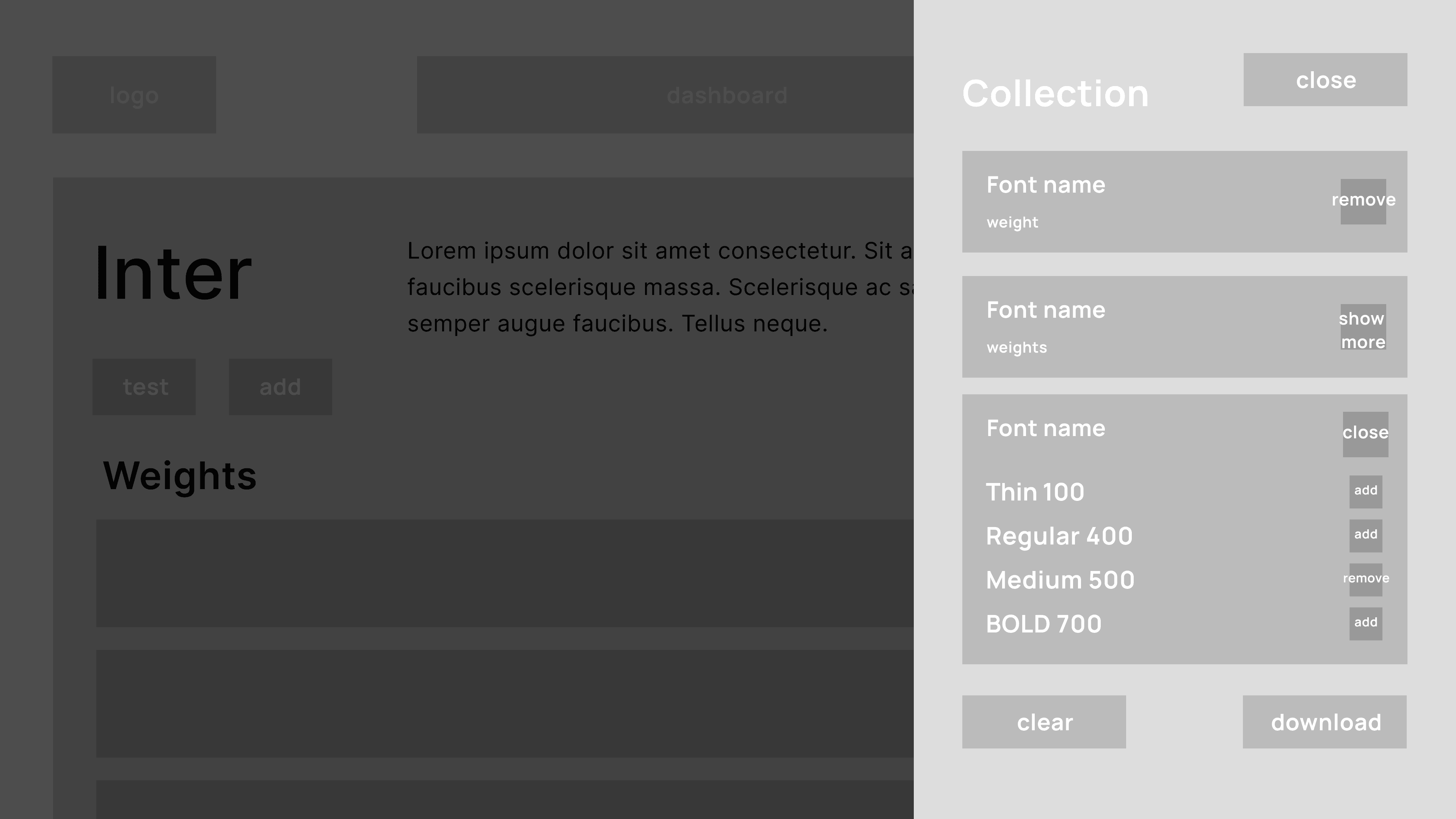
Design
From Concepts to Components

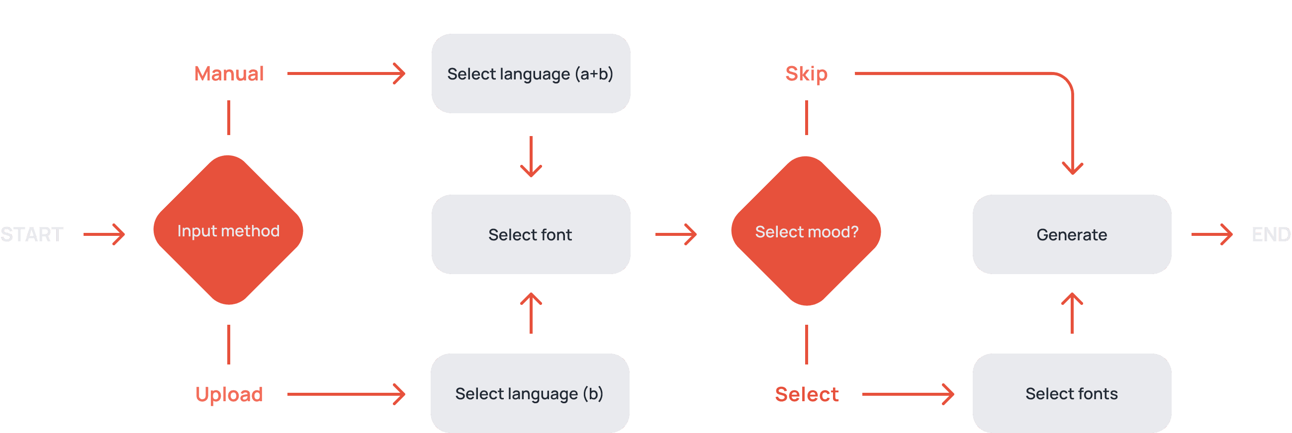
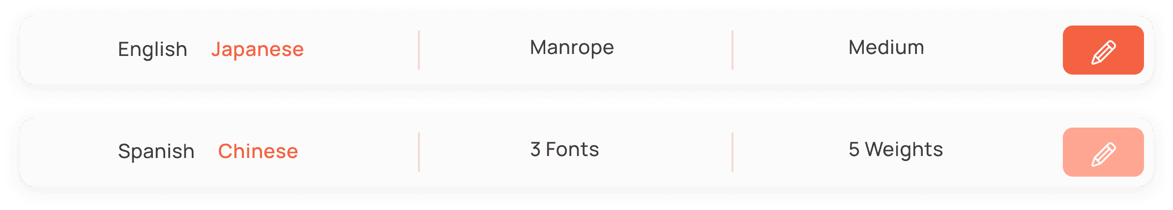
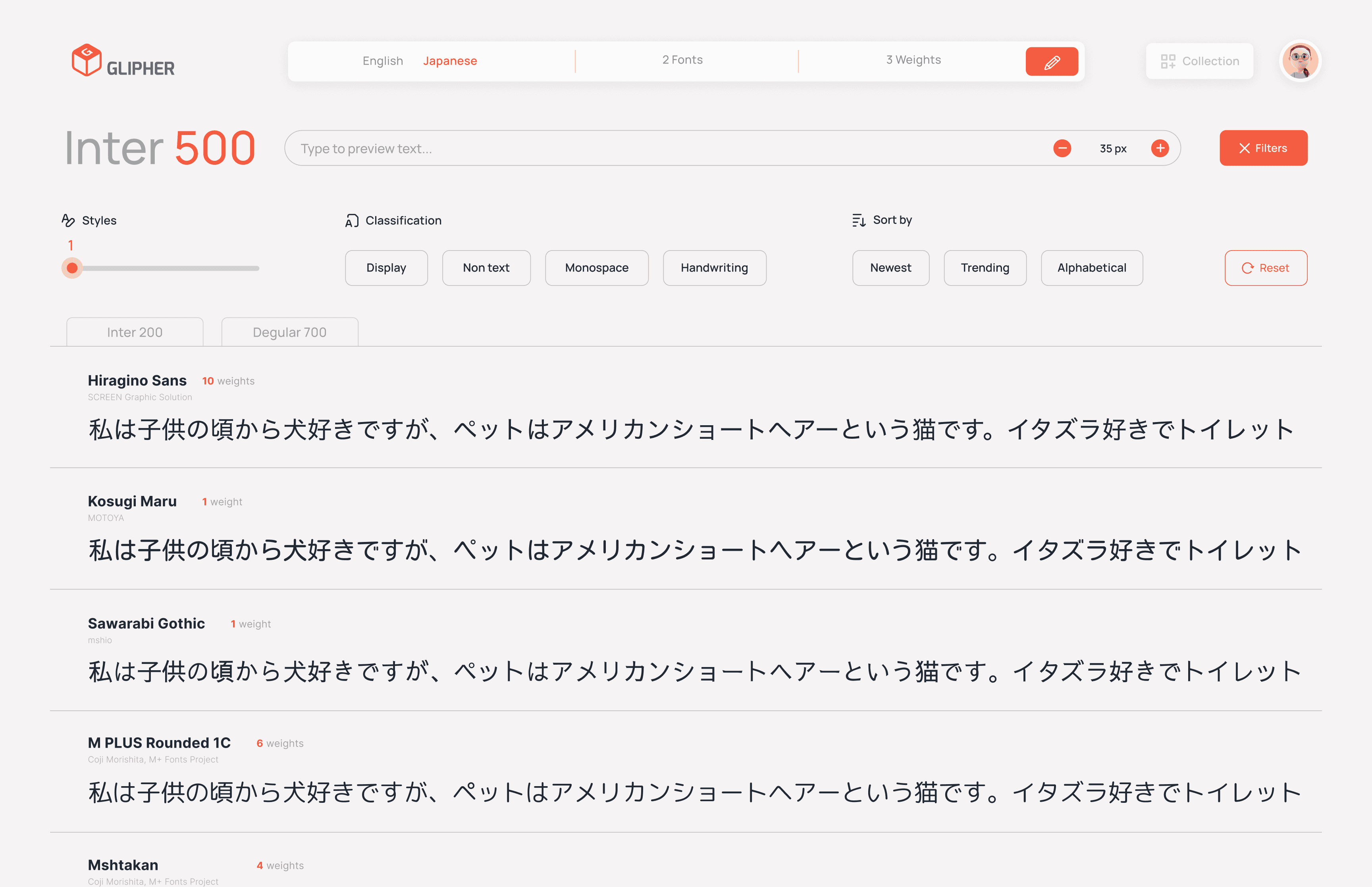
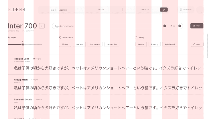
Task flow 1: Generate font list
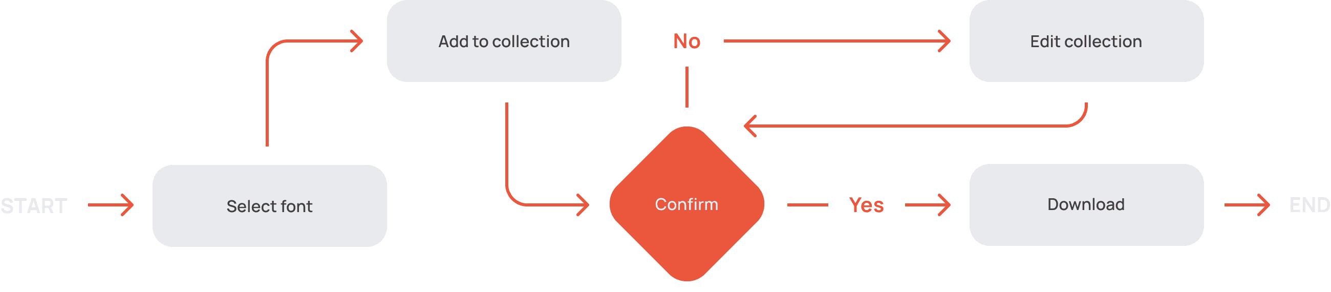
Task flow 2: Download fonts
The design choice addresses users’ needs for ease, consistency, and efficiency. Task flows were crafted to simplify core actions, while wireframes focused on a clean, intuitive layout, creating a natural experience.


Input method
Select fonts
List generated
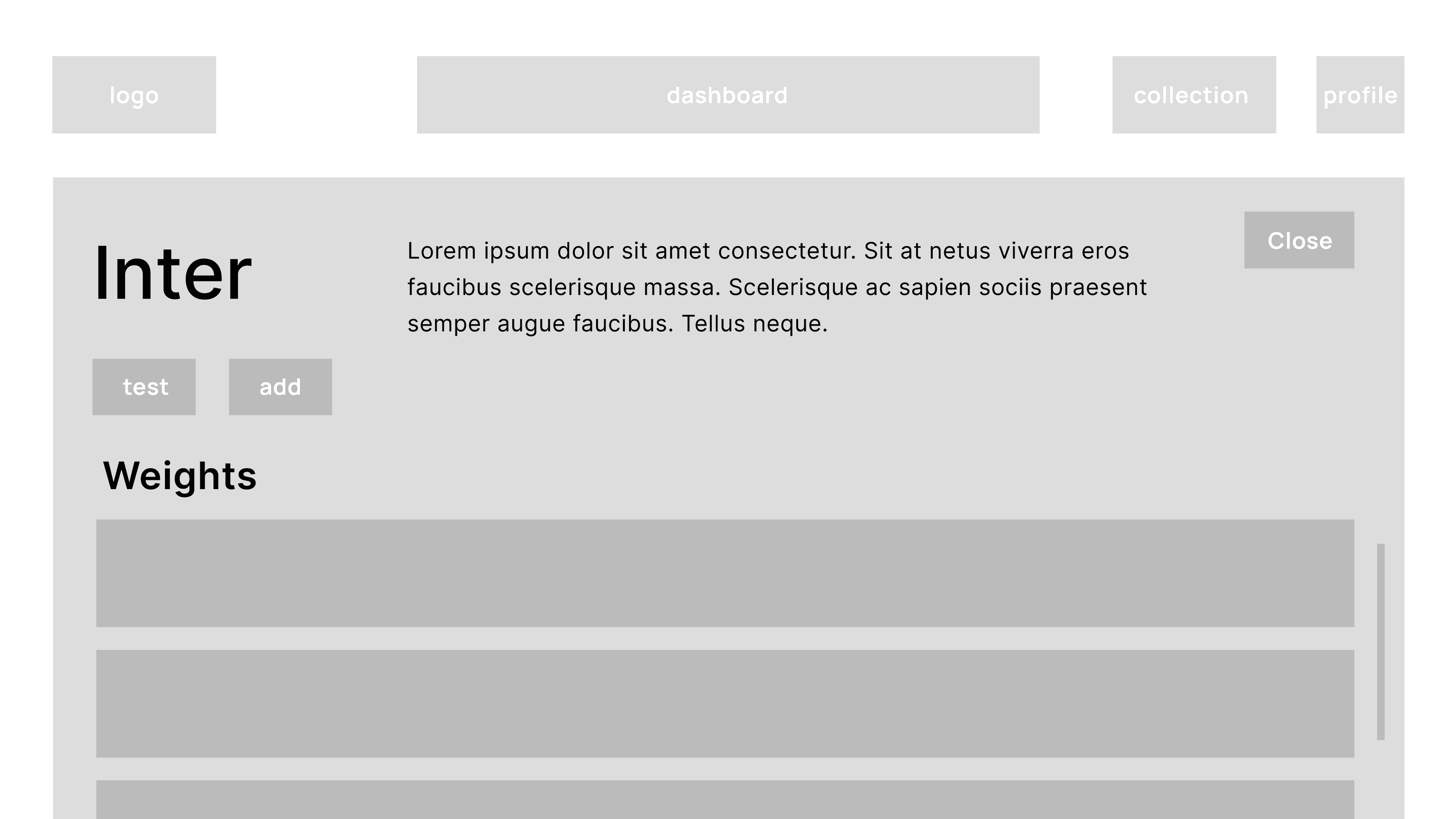
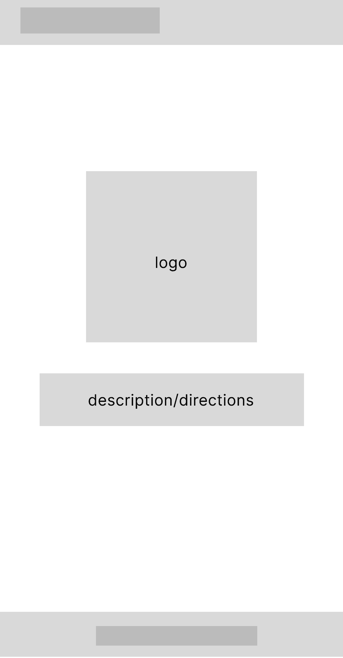
Font list
Font page
Collection
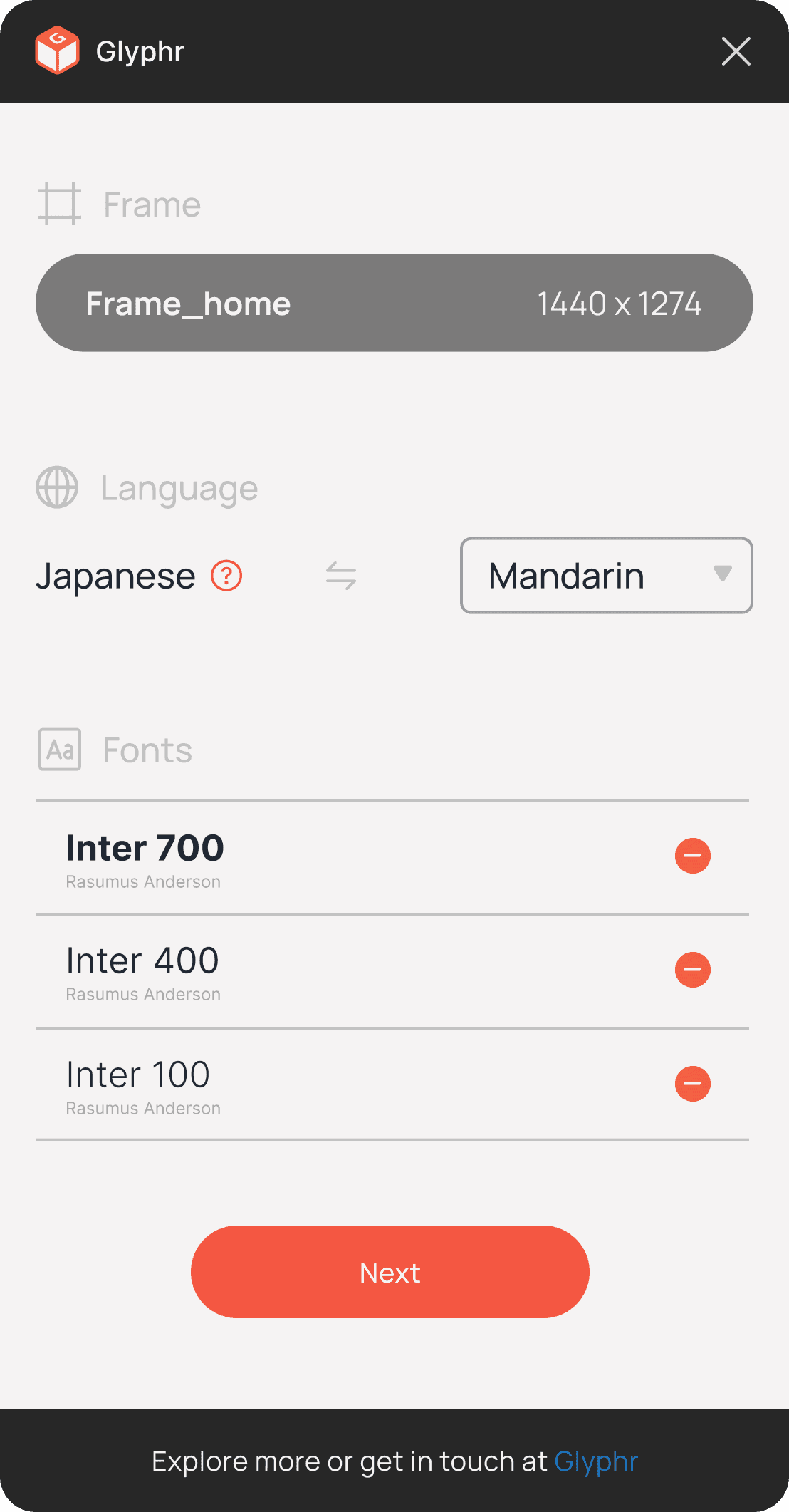
Task flow 3: Generate font list (plug-in)

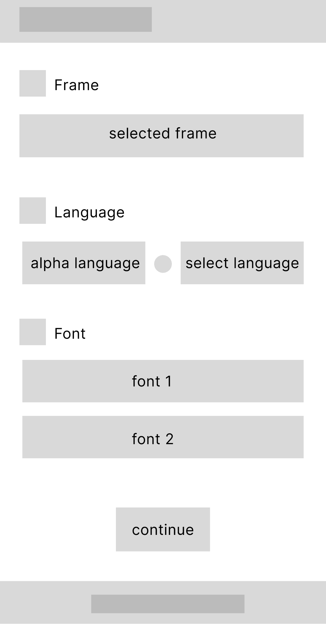
Select frame
Language and fonts
Mood selection

Design
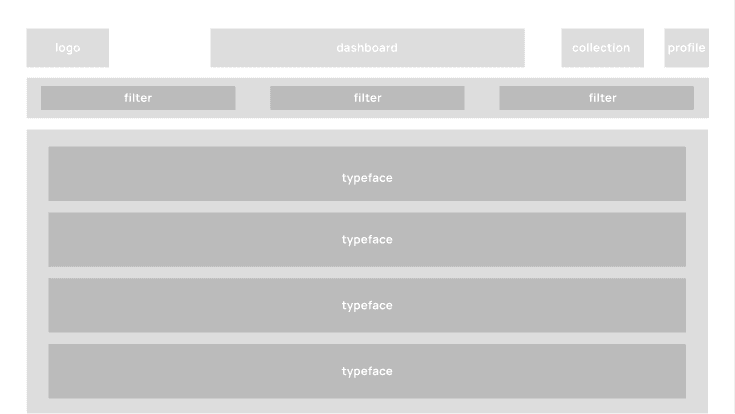
Structuring the Solution
Outlined taskflows and wireframes illustrate how the app guides users through key actions like inventory tracking, macro logging, and recipe discovery.

While the core taskflows stayed consistent, many visual and interaction details evolved through user feedback and iteration.
Designing With Feedback
Crafting a Familiar Feel
The moodboard sets the visual tone with a paper-like warmth, using soft whites for an organic feel. Accents of red-orange throughout the design channel the familiar lines of a notebook, creating a UI that feels both approachable and thoughtfully crafted.

Style and Components
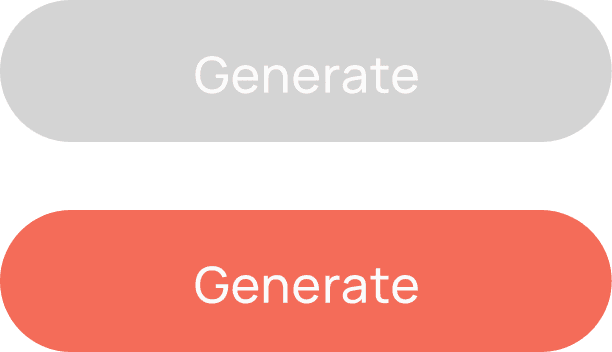
Building on the warmth and familiarity of the mood board, the interface takes on a refined simplicity. Every button, icon, and slider is crafted for ease and clarity, guiding users seamlessly while balancing aesthetics with practicality.
ABCDEFGHIJLMNOPQRSTUVWXYZ
abcdefghijklmnopqrstuvwxyz
1234567890?!@#$%^&*()[]{}
28px
Regular
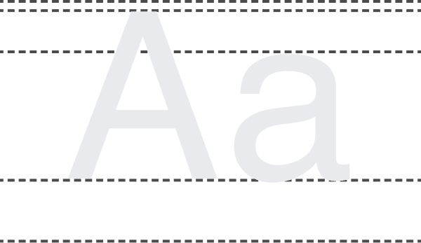
Aa
Medium
Aa
Bold
Aa
Manrope
Mikhail Sharanda
TYPEFACE


#F46C59
Hot Coral
#FBFBFB
Whiteout
#70D5E1
Aquamarine Blue
#424242
Black Panther
#202833
Freinacht Black
COLOR PALETTE
INTERACTIVES


DASHBOARD
Drop Shadow: Y 4px, X 0px
Blur: 20px
Opacity: 7%
WIREFRAMES


Result
Bringing It All Together
The final designs unify research insights and user needs into a cohesive, intuitive experience. This is the result of a user-centered approach, where each element serves a purpose in making multilingual design simpler and more effective.
View in PDF
Figma Prototype
Takeaways
Designing this project taught me the balance between creativity and function, especially in a straightforward space like font platforms. Crafting a unique, user-friendly interface without compromising usability was a challenge. Translating the full web tool into a streamlined plug-in pushed me to further simplify processes, focusing on essentials that enhance the user experience. Overall, this experience highlighted the power of clarity and purposeful design.


Next projects…


© 2025 Rick Takeda. All Rights Reserved.